FUI, Animated GIF's, and Zero UI: Engaging Presentations and Artifacts

FUI, Animated GIF's, and Zero UI
Engaging Presentations and Artifacts
A Bit of History
My foray into technology and design began with the advent of the public internet and the introduction of HTML. During my high school days, I recall the revolution of AOL/Compuserve/Prodigy and many households were going online. It was a wild future, access to any information in your home, access to chat, MP3s! And my days were spent collating vast collections of music to play on Winamp, chatting on AOL, and learning how to code in HTML and JAVA. It wasn't my first foray into programming, but it was the most interesting, now I could share my creations with my friends. Thanks Geocities, Angelfire, and Tripod!
Fast forward to college and I was free-lancing web design and development; it was a great way to make some cash outside of selling 'plat' from all my Everquest'ing. But with college wrapping up, I had a decision to make, there was a fork in the road for my career: Development or Design?
I always loved art, a sketchbook as a child was always at my side, but I always wanted to be an engineer of some sort; I loved learning how the world works. So this was a tough decision. Needless to say I moved into development, the jobs were more plentiful and the money was better. But I never lost my love for design, and good design is differentiation.
Move forward another decade or so, and I'm a practicing enterprise architect, digital transformation specialist, etc. My days are less hands-on-keyboard programming, and more presentations, influencing, strategy and artifact creation. And to avoid having stakeholders fall asleep in stand-ups and pitches, I've applied my love for design. Below are some insights, inspirations, tips, and tools I use as an architect to keep the audience engaged.
I've written about Data Visualization in the past, this article is something a little different: a mix of inspiring aspirations, under utilized tools, surprising resources, and where the future might be going.
Fictional User Interface
A term usually only found in movies or entertainment. FUI is Fictional User Interface or sometimes referred to as Future User Interface, it's the conceptualization of user interfaces typically for sci-fi movies, games, or TV shows. I've found the user interfaces in movies like Iron Man fascinating, and as an architect I've thought "why aren't we interacting with technology in this way"? Well first of all, we don't have holograms, but otherwise we do have the tools to do it now. We have voice assistants, machine learning and AI, we do have instantly responding glass interfaces. So why aren't we there yet? On the hundreds of projects I've led, solutioned, or been a part of; the simple answer is the investment isn't usually there. Leaders want as high an ROI (Return on Investment) as possible; it makes business sense and it props up their own career. But I can't help but think, how much better, useful, and more accessible some of those applications would have been if they were simply just easier to use, more beautiful, and ultimately more engaging.
A Futurists Outlook on the Value of Creativity
As we move forward with cheap compute, storage, and the prevalence of MVP and AGILE, the importance of design cannot be understated. The simple fact is, many enterprises and companies have little uniqueness to offer. Most futurists I've talked to, some in very influential enterprise positions, believe faithfully that the future of jobs will eliminate many functional positions via A.I. and machine learning; and also believe that human roles will be entirely creative or influence based. Having done deep analysis of EA roles and digital transformation efforts keen on eliminating wasteful processes, I would concur with this, even with current technologies and trends. As we continue to progress into an A.I. age, the value of human creativity will become more and more lucrative.

Marketwatch: How job predictions apply to 2016 U.S. employment statistics. Black fields are jobs likely to be automated and white fields are jobs that are likely to remain.
Examples of FUI's in Entertainment
FUI (Fictional User Interfaces) are usually cinematic, a plot device to exemplify that "this is the future" or "this is technologically advanced". In some cases this is badly done such as the "hacking" montages seen in the 90s and 2000's. I particularly find this CSI snippet to be hilarious "I'll create a GUI in Visual Basic, see if I can find an IP address":
In other examples, the FUI is extremely complex, and realistically unusable. The Marvel Iron Man series is a cocaphony, holographic UI's that display so much information they would be almost unusable unless you were an genetically designed techno-messiah genius like Tony Stark:
But there are quite a few examples of creative FUI's that are believable. My rabbit hole into inspirations for new architectural visualizations led me to well respected creators such as Bradley G. Munkowitz, aka. GMUNK (Oblivion, Tron Legacy) and Jayce Hansen (Star Wars, Iron Man, Avengers, Pixar). There are also companies that specialize in visual CGI effects focused around FUIs, such as SPOV (Dr. Strange, Call of Duty, Life). I particularly found the Oblivion movie FUI's to be usable interpretations, not only are they minimalist but they espouse Ed Tufte's "White, black, grey" aesthetics:
Value Proposition
It's clear that as a practicing technologists, whether an architect or someone in digital transformation, the time commitment to something as complex as the above Hollywood FUI's would possibly be a complete waste of time. The reason I say possibly is that I've consistently run into technology projects and programs that equal or surpass the funding of these Hollywood blockbusters; it's always irked me in some way why we don't take more time to visualize in a more dynamic and entertaining way the concepts, architecture, or data to be more compelling and engaging. But can we perhaps achieve some semblance of this in cheaper, easier, and more time efficient manners?
Animated GIFs
Yeah, you read the correctly. Why and how would an animated GIF be useful in an enterprise or business setting? Five years ago I would have considered this preposterous, but now most anyone has been thoroughly exposed to meme's or GIF's in some manner, from old to young. If it's an accepted norm in today's culture, surely we can leverage this for use in business and enterprise. It's a trending technique to utilize animation, simple slides, and humor to present to a wide audience. A good example would be the talented Onsi Fakhouri, SVP Cloud R&D at Pivotal Labs, an engaging evangelist that uses simple Keynote animations, emojis, and other tools to keep his audience engaged but also entertained. A far cry from the FUI's exemplified above, but a good example of how animation and simplicity can communicate complex concepts.
I've found that drawing on the wealth of animated gifs available from talented creators, we can bridge the gap between intense cinematic FUI's and simple yet time consuming Keynote animations. In most cases, these are simply practice exercises by professional animators, in some cases they works of art. Some examples I've used below (apologies for no source or creator information, a reverse image search via Google can provide).

Database Indexing

Cloud Elasticity

GitHub

Application Layers

Microservices
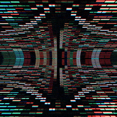
Data streaming packets

LIDAR

Load Balancing and Routing
Other animated gif's can be used as focal points, attracting the audiences or users attention to a critical point. A few examples I've used in the past below:

Developer Isolation

Error
Legacy Hardware

My Pinterest board for useful or captivating animated gif's (click through to open)
Where can you get GIF's like these? I've found Pinterest of all places to be a useful resource. Pinterest suggests 'pins' based on what you've saved in the past, so it's a good idea to capitalize on these algorithms continually get a good drip feed as they percolate through the internet and social networks. If you find one similar to the concept you are trying to express, clicking on it and scrolling down will show suggestions of similar GIF's. My own board can be found here.
Tools
But what happens when you find that almost perfect animated GIF. It just so happens the internet is rife with animated gif's, and thus there are a lot of tools that can be used to edit, reverse, and crop them in whatever way that may suit your needs. I've found EzGif one of the simplest tools to use in this scenario at https://ezgif.com/.
The professional FUI designers use a mixture of tools, usually requiring an art degree and thousands of hours of practice; as described in Jayse Hansen's bio:
“Main arsenal: Illustrator>Photoshop>Cinema 4d>After Effects etc.”
PowerPoint and Keynote Animations
The most common business related communication tools are PowerPoint and Keynote. These easy to use presentation tools from Microsoft and Apple are rarely used to their full potential. One of the most useful and overlooked tool in these applications are the Animation Tools. As a practicing architect I've produced a large number of "Architecture Roadmap" artifacts, showing the evolution of an IT ecosystem from current to target to communicate the strategy and plans for a particular group. Through experience I've found that most of my time presenting these road-maps consist of lines such as "as you can see, X is retired, and Y has replaced it". I've wished I could animate the transformation, showing clearly the evolution; fortunately PowerPoint and Keynote allow complete animation of shapes, and you can now do this proficiently without fuss. One thing to keep in mind however is to still separate the evolutions as to remain printer friendly. Some quick tutorials below:
“If you look at the history of computing, starting with the jacquard loom in 1801, humans have always had to interact with machines in a really abstract, complex way.”
ZERO UI
A newer buzzword, Zero UI, was coined back in 2015 by Andy Goodman, group director of Fjord; a think-tank from Accenture. The concept is readily apparent with today's voice assistants and IoT devices; devices that primarily interact with the user through speech or sensors. I imagine we'll eventually start to see architecture and IT systems interact with professionals in similar context. I've written about "The Case for A.I. in E.A." previously, why not extend this A.I. to purely voice interactions via Zero UI?
Screens are surely not disappearing anytime soon, the amount of data we can process visually as human beings is not something to be tossed aside. But we can always do a little better, engage our audience a little more, make things more exciting; why not?